 Lena Arvel
The brief
A fictional independent paper studio needed an identity that felt as tactile as its products. It had to work on a small package label and give an online collection a clear visual language.
Visual identity
A visual identity for a paper studio, inspired by the simple act of folding.
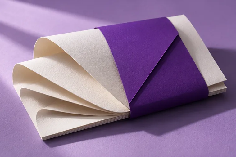
A fictional independent paper studio needed an identity that felt as tactile as its products. It had to work on a small package label and give an online collection a clear visual language.
A single fold became the recurring motif. The mark and type stay simple at small sizes, while the violet palette and close-up material photography give packaging and the storefront a shared character.
A visual identity system, packaging concepts, and art direction for a digital storefront.